Responsive Design
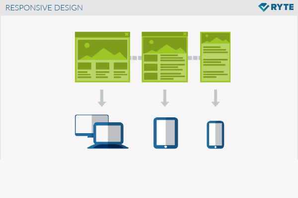
In responsive design, an Internet site will be displayed differently depending on the screen size and/or type of device, in order to ensure visitor-friendliness. This is particularly applicable for the small display screens of mobile devices, where a different representation of the page would actually be required.
Background
The usual design of a Webpage is based on computer screens, as they exist in a workplace. In recent years, however, mobile devices have been developed that have significantly smaller screens, for example, netbooks, tablets, and smartphones. On a small display, webpages look different than on large screens and user-friendliness (Usability) is greatly reduced. A responsive design reacts flexibly to the respective device. A good User Experience can be guaranteed on mobile devices with a separate Design for small screens. This is called Mobile User Experience. In the “Mobile First” concept, the mobile website gets created first and then extensions are made for bigger screen sizes.
Motivation
The number of mobile devices is growing, and the number of Internet users who access the Internet on such devices is also increasing. Responsive designs would be required to provide these visitors a good experience with the website. The lack of a good user experience with common websites on devices with small displays screens will result in Conversion losses. The use of responsive design is forward-looking, since the offer is available to every user in a user-friendly design. The communication between the website operator and its visitors does not suffer because of the type of device being used.
Implementation
Responsive designs can be realized with HTML5 and CSS3. Media queries are provided, with which information can be requested from the device in question. This includes features such as display size, resolution, and format, as well as capabilities such as keyboard, finger, language, etc.). The content and layout of a page must be strictly separated so that the responsive design will work correctly.
Media Query
Media Queries are used in CSS3. other properties are available in addition to the distinction between “screen” and “print.”[1]
<link rel="stylesheet" media="screen and (orientation:portrait)" href="example.css" />
This example shows the link from the HTML document to the Stylesheet. In addition to the “screen” specification, the MediaQuery also contains another restriction, specifically that it should be a portrait format. The corresponding paragraph in the CSS file “example.css” looks like this:
@media all and (orientation:portrait) { … }
Optics
Through the use of responsive designs, the same content is provided in a slightly modified format for different devices. The reduction of the elements may be appropriate for small display sizes. In essence, the existing elements are shown structurally different. One example is the change between portrait and landscape format. The modified page ratios require a restructuring of the elements, but their function remains the same. The HTML code remains unchanged, only a different style sheet is used.
The prioritization of the existing elements plays an important role in the restructuring of the webpage. A thorough consideration of what elements will slide down on the page and which ones can be deleted because of lesser importance is essential. This development is time-consuming and provides space for SEO measures.
Relevance to search engine optimization
The development of a responsive design is very complex depending on the size of the website. But once developed, it is very easy to maintain, because content has to be created only once and is then available in every design. The development effort can be worthwhile from an SEO perspective because it improves the user experience for people who go online with mobile device. This increases their Dwell Time on the website, which will have a positive effect on the Ranking of the page. Moreover, the Bounce Rate will decrease, because a user-friendly website is positively received. A responsive design will also not limit the use of the website with conventional devices. Relaunching a website is a good opportunity to offer it with a responsive design in the future.
Another response to the increasing numbers of mobile devices is to create a separate website for mobile users, which is not recommendable from an SEO perspective. This self-contained domain will need to be separately optimized and maintained. It is hardly linked, barely gets Link Juice and usually contains Duplicate Content. Thus, the mobile site won’t be found by visitors via the search engines and thus rarely used.
The responsive design concept leads to more advanced ideas for keyword optimization. Search terms entered on a mobile device tend to be shorter and formulated differently than would be the case with a physical keyboard. Thus, the difference in user devices could also result in a change of Keywords.
Google supports and recommends responsive design[2]. One advantage is that the Googlebot saves resources and can index more content of a website. As a prerequisite the crawler will need to have unrestricted access to external files such as CSS and JavaScript.

