Flat Design
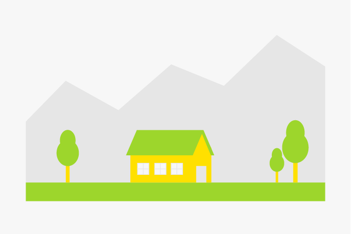
The term flat design describes a special kind of web design in which the functionality of the website is in the focus. This is done without the usual design elements such as textures, adornments or drop shadows, in order to reduce the design to its core.
Principle of Flat Design
The flat design stands in contrast to skeuomorphism, which in the past was about orienting websites as closely as possible to the "original". An often cited example are note apps that look like a real notepad, from the lined "paper" to the "leather cover", which have been realized with the corresponding textures. A flat design deliberately dispenses with 3D elements, lighting effects or three-dimensional buttons. Instead, clear lines, easily legible lettering with a rather elegant progression and the play of colours are what count here. Innovations that go hand in hand with the flat design are, among other things:
- Free choice of fonts (web fonts)
- Design icons using fonts (vectors) that can be scaled by any browser without loss of quality
- No use of background images or textures
- Structuring by colored surfaces and buttons
- Strong clarity of the website
- Intuitive navigation
- High usability
- Focus on content instead of design
- No need for small layouts with too many pictures
Typical representatives of flat designs are, for example, one-pagers, where all the information is on a single subpage - a frequently chosen variant for corporate websites that would have only a few subpages. Supersized websites, where a single large graphic and only one single statement is at the centre of the homepage, are also part of the "Flat Design" concept.
Examples
Even before flat design came into its own, there were already a number of large manufacturers who implemented the principle. This includes, for example, Microsoft with the Metro design of Windows 8, which differed greatly from its predecessor versions. This development could also be observed in current smartphone operating systems such as Android or iOs and smartphone apps are designed in this way.
Difference to Responsive Design
Responsive Design is often mentioned in the same breath as Flat Design. However, both terms do not mean exactly the same thing. Responsive Design is a web design that adapts effortlessly to a wide variety of browser models and can therefore be viewed on a small smartphone display as well as on a 24-inch monitor without restrictions. Flat design, on the other hand, exists independently of the selected device. Responsive Design is often also flat, but Flat Design is not automatically responsive. Nevertheless, a flat design plays into the hands of Responsive Design. It reduces loading times and is more flexible and adaptable to different solutions. It can therefore be part of Responsive Design.
Advantages of Flat Design
Flat design requires far fewer design elements such as images or complex effects. This means that significantly less data has to be transported when loading the website. On the one hand, this has a positive effect on loading times, but is also sensible for mobile phone users, particularly with regard to the utilisation of their data volume. Flat design prevents websites from being overloaded, which can make it difficult for the user to use.
Disadvantages of Flat Design
A disadvantage can be that the loss of a website's own character can also result from the abandonment of certain design elements. Many pages with a flat design are very similar in terms of structure and design. The recognition value may not be sufficient under certain circumstances.
Navigation can also be problematic. This is particularly important for small devices. Flat design makes it more difficult to guide the user and show him how to navigate the website correctly. If the behaviour which the user has already practiced on countless other websites is not implemented consistently, this can lead in the worst case to visitors leaving the website.
Experts even assume that a flat design for an online shop can even mean conversion losses if it is implemented too extreme. The reduced design means that conversion elements no longer stand out from the rest and can no longer be sufficiently perceived by the user.