Google Mobile-Friendly Update
The Google mobile-friendly update was gradually rolled out starting in 04/21/2015 after being announced by Google in February 2015.[1] This update is a fundamental change in the algorithms of the SERPs as output on mobile devices. The main point: websites and apps that have been optimized for viewing on mobile devices are given preference by Google and positioned accordingly higher in the rankings. In the SEO industry, the term Mobilegeddon has established itself for this update because the effects could be considered enormous.
General information
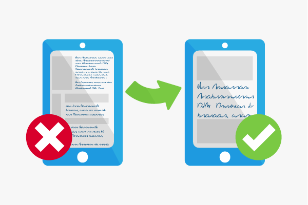
Google wanted to improve the user experience on mobile devices such as smartphones, tablets and phablets with the mobile-friendly update. The background is that searches are carried out more frequently on mobile devices. According to recent surveys, Internet users use their mobile devices for almost 70% of their Internet searches to gather information, buy products or conduct navigational searches. Add to this the increasing sales for mobile devices. In particular, younger users access the Internet with these devices.
At the same time, many websites and applications are not designed for smaller displays and their idiosyncrasies. Different conditions are associated with smaller displays, various types of operating systems, and less hardware resources, which this update focused on. User displays on mobile devices are characterized by features that are different to using the Internet with your desktop PC or laptop. Google therefore believes that mobile searches should also have different search results. That is exactly what Google implemented with its mobile-friendly update. Mobile-optimized websites and apps are positioned higher in the search
How it works
The update affected the following areas:
- It only affected mobile search. The traditional Google search on desktop PCs is not affected.
- It affects the SERPs in all countries where Google products are available.
- It does not necessarily concern entire websites, but individual pages that are shown to match a search query.
Google stressed that this update does not excludes non-optimized pages. If a particular page provides high-quality content for a certain search query, it can still rank quite high.[2]
Practical application
Google recommends testing your website using the mobile-friendly test. The site is crawled and evaluated with a rendering. The crawler displays the page as it would be seen by users of mobile devices. If the test is passed, a screenshot of this display will be included.
There are additional ways to test a website in Google Search Console. Under the item Mobile Usability Report or Mobile Usability, you can see which points still have potential for optimization. Crawling errors, false redirects or internal links can be checked for, so that user experience can be reconstructed based on the data. A Page Speed Test is useful for mobile optimization, since any excessive load times can be identified. Crawling errors can also be detected with the “Fetch as Google” function.
Mobile SEO
Common Mistakes in mobile optimization are:
- Blocked content: The crawler requires access to all JavaScript, CSS, and image files used in order to render and index. Therefore, you should check the robots.txt.
- Unplayable content: Video and animation sometimes need a particular licensed player for playback, for example, Flash player. Such media and content types should be created and integrated according to Google with HTML5 standards to ensure their representation.
- High load times: Long waiting times can lead to high bounce rates. Users abandon the site if they have to wait too long. Such problems can be identified and corrected with Google’s Page Speed Test Insight tool.
- Redirect error: When mobile-optimizing specific pages, they should always direct to the correct mobile page. If they do not, no redirects should take place. Google prefers a responsive design regardless, which avoids such errors from the outset.
- Unnecessary internal links: If you have a desktop version and a mobile version, you should consider in detail which internal links make sense, based on the respective usage scenario.
- Specific 404s: - If a desktop version of content displays well, but the mobile version does not, then this is a specific 404 error which is visible only on mobile devices. For redirects, 404 errors should always be avoided on mobile devices.
- App download interstitials: Some mobile sites advertise apps using interstitials. If these are incorrectly integrated, they can negatively affect the user experience. Google recommends using inline banners.
Relevance to search engine optimization
The impact of the Google Mobile-Friendly update was enormous. Nearly 40% of websites from the top 500 list of Fortune were affected and had enormous traffic losses.[3] Google announced the update early on and allowed webmasters a span of two months for mobile optimization. Nevertheless, some large companies missed the deadline for adjustment. The trend of moving toward mobile is also associated with important changes. These partly technical aspects are known in the SEO industry but websites that rely on third-party service providers may not make these changes immediately.
Nevertheless, the Google mobile-friendly update is to be regarded as an opportunity because once a site has been mobile-optimized, it will be automatically detected by Google as being mobile-optimized. It will then be indexed and likely prominently displayed again in the mobile SERPs, although that depends again on many different ranking factors. In addition, Google helps mobile optimization with numerous guides, guidelines, and tips, so that you have enough resources at hand.
References
- ↑ Finding more mobile-friendly search results googlewebmastercentral.blogspot.de. Accessed on 05/18/2015
- ↑ Rolling out the mobile-friendly update googlewebmastercentral.blogspot.de. Accessed on 05/18/2015
- ↑ SGoogle’s “Mobile-Friendly” Update Could Impact Over 40% Of Fortune 500 Websites techcrunch.com. Accessed on 05/18/2015