How to Improve Your Mobile Conversion Rates
Conversion rates from users surfing the internet with smartphones is still lower than it should be. In this article, we give you some advice how you can increase the conversion rates of your mobile users.
For most websites, mobile traffic overtook desktop traffic a long time ago. Mobile usability is also a ranking factor for Google. But does rising numbers of mobile visitors also mean a higher mobile conversion rate?
Is only a purchase considered a conversion?
On mobile devices, the rate in which items are sold is lower than it should be, considering the increased use of mobile in recent years. Smartphone sales are only half of sales carried out on a desktop, whereas traffic from smartphones is twice as high.
It's important to record which mobile interactions should be counted as actual conversions. Does the customer actually have to buy or does it count as a conversion if they searched for a product, looked at it, compared it with others, and read the product details?
This interaction may have provided valuable information for the seller, and therefore the purchase could at least partially be attributed to this.
The three cornerstones of conversion optimization
These three factors are the most important in conversion optimization, and help to provide direction for the implementation of mobile optimization measures:
1. Business: Market & target groups
**
2. Technology
**
3. Design & psychology
Let's first consider the business component: the investment and market in relation to the target group and their behavior:
1. Business: Mobile users aren't always on the go
For improving mobile conversion rates, it’s important to precisely analyze the mobile target group. 'Mobile' doesn't necessarily mean 'on the go'. Many users surf the internet on their smartphones or tablets at home. With Google Analytics, you can easily check on what devices and at which times people surf the internet or convert. For example, in the Mobile Overview in the Audience report, you can set "Hour" as the secondary dimension to see on what devices the majority of sessions or conversions are at a certain time of day. If the majority of mobile visits and conversions are in the evening, you could infer that mobile users are accessing your website from home. In this case it could make more sense to focus on customer and purchasing support than branch locators or content relating to the nearest store.
:format(avif))
Figure 1: See what time of day people visit your website on mobile devices
Keep multi channel tasks in mind
In the area of multi-channel marketing (also omni-channel marketing), mobile applications are distinguished according to their place and purpose of use, for example a user is in the shop and is requesting more information about a certain product, or is within 5 miles from a shop searching for information, then being encouraged to visit the shop. Sales or promotions work well in this case, and mobile users who are more than 5km away from the shop will be shown other content.
This approach is a good starting point for developing profitable features when planning your own web applications or your mobile website. You have to know the usage context of your target group.
Attribution models
Marketers have been debating for years how to correctly attribute their budget: "I know that 50% of the marketing budget is money out the window. I just don't know which half!"
The advantage of digital marketing is that customer movements are more easily measured. Attribution modeling now attempts to evaluate every marketing channel for its monetary value by attributing its contribution to a conversion.
This is easy to see in Google Analytics with the Multi-Channel Funnel report under Conversions and in the Model Comparison Tool under Attribution.
It's not always easy to work which advertising measures contribute what. It's similar to a football team. Not every striker is responsible for winning and goals, other players are actively involved too. They assist and prepare goals. The management, however, is thinking about which players they will buy and what they are worth to them.
In marketing, this means, even if a banner campaign doesn't lead to any directly measurable conversions, it contributes a value and has a supporting function towards the goal.
Through the various models of attribution, you can find out how high the contribution is and whether the investment was worth it and will continue to be worth it.
Model overview:
First Click
The first click counts model counts the first point of contact of a customer as solely responsible. This makes sense if the 'lead' and brand awareness play an important role for the company and for market communication.
Last Click
This model is used especially if brands are well known and communicate via many campaigns and channels. That way you can see which measures have a direct impact on the purchase.
An even distribution of all touch points is especially interesting for businesses where the marketing budget is administered centrally. A small deviation from this measuring method is the chronologically increasing evaluation. The closer the completion of the deal, the higher the effectiveness is rated. Marketers who like the RFM model (R = Recency, F = Frequency, MR = Monetary ratio) get additional measuring data by doing so.
Ideally, the attribution model should be user-specific, i.e., fine-tuned for the respective marketing mix, marketing measures and the relating business goals. In Google Analytics, you can create your own customized attribution model that best fits your business.
You can find out more about attribution modeling here.
:format(avif))
Figure 6: Create attribution model in Google Analytics
2. Technology: Responsive Server-side Servlets
Responsive design solves an old issue for web developers: there's no need to create an individual website for every device, resolution and browser version.
For mobile website programming, there are two approaches: Responsive Web Design (RWD) and Adaptive Design. For Responsive Design, the device "decides" how a page is displayed. With Adaptive Design, the servers "decide" which version of the site is delivered.
If you have worked with Responsive Web Design projects before, you know that the development often involves more work than originally anticipated
Switch-to-desktop link for hidden content
A recurring visitor will often switch devices, so it makes sense to offer a smartphone viewer a switch-to-desktop link, especially if content is altered or hidden on the mobile version so that every target group is satisfied.
Fluctuating bandwidth
Fluctuating bandwidths are a real conversion killer. That's why it's important for mobile websites to use browser caching and the browser database so only the relevant, changing content has to load. This means that if the connection fails, the user's device can fall back on locally saved content, e.g., when a user uses the back button.
The development of SPAs - Single Page Applications - are leading the trend that addresses the technical issues of mobile usage. This means that relevant parts are loaded before or afterwards, so the user has a smooth user experience without loading times.
3. Design: Adjusting forms and keyboard
Since the introduction of HTML5, developers can semantically enrich forms. For example, boxes in which email addresses have to be inserted can be marked as Type="email" so that the browser can interpret it. The browser can recognise what entry is expected and can more easily validate it. This is especially advantageous for mobile browsers that have a corresponding keyboard pop up that for instance comes up with the @ symbol for quick typing of an email address. So the user doesn't have to toggle to special characters. This speeds up the entry.
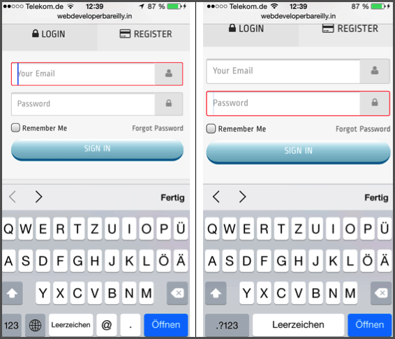
Image 9: Depending on the box, the keyboard layout will change.
Pop-ups and lightboxes
A common mistake for mobile websites is balancing secondary goals on home or landing pages, for example surveys, signing up to newsletters, actions or confirmations for using cookies that are inserted as overlay, interstitial or as pop-ups.
The reading flow is interrupted and in many cases the 'close'-button is outside the field of vision. To solve the issue, mobile websites have to be excluded from pop-ups.
FadeIn elements are covering important content.
Since most websites use 960 or 1200 pixels, there is still space at the edges on displays with 1280 pixels in width. Often this space is used for social media bars or requests to sign up for newsletters.
Many designers forget to hide this feature for smartphones and tablets. This can be annoying for mobile users, for example because the side bars don't miniaturise and they therefore cover important content on the website.
Conclusion
There are many ways to solve issues on mobile devices. Which solution is suitable for your website is something you can find out by setting your conversion goals and identifying your mobile target groups and their behaviour.
Conversion goals are best set internally when project tasks are being evaluated and priorities are being set. Attribution modeling can play a role in helping you to judge the importance of mobile for your conversions. Read this article for more insights about how your website traffic is split between mobile and desktop.
Ryte users gain +93% clicks after 1 year. Learn how!
Published on May 2, 2019 by Olivia Willson
:format(avif))
:format(avif))
:format(avif))
:format(avif) "How Do You Conduct a Technical SEO Audit?")